Overview
Tailus is a Figma UI kit built on Tailwind CSS: pre-designed components that adapt across screen sizes, organised around the same tokens a developer uses in code. The idea was simple. If the colours, spacing, and type scale in the design file are Tailwind's own, nothing gets lost between the mockup and the build.
I ran the project end to end: four rounds of interviews, competitive research, the information architecture, the prototypes, and the final component set.
Research: Four Groups, Four Questions
A UI kit sits between people who want different things. A business wants conversions, a user wants to find things, a designer wants to move fast, and a developer wants something they can actually build. So instead of one research round I ran four, each with its own goals.
| Group | Who | Time | What they told me |
|---|---|---|---|
| Businesses | 12 business owners | 15 days | Conversions, brand consistency, and accessibility matter; so does less design-to-development time |
| Users | 20+ users | 30 days | Clear hierarchy, fast pages, and layouts that work on every screen |
| Developers | 15 developers | 15 days | Translating specs into code is slow, and design and dev tools disagree |
| Designers | 20+ designers | 30 days | They want consistency, a ready component library, and room to iterate |
The Problem: Two Tools That Disagree
The clearest pattern came from the developers. Every one of their top problems was a version of the same thing: the design file and the code describe the interface in different terms.
| What developers said | What it costs |
|---|---|
| Design specs are hard to turn into working code | Time spent measuring and guessing values |
| Design and development tools don't match | Small errors that pile up in review |
| No standard components or guidelines | Every project looks slightly different |
| Designer–developer communication is unclear | Back-and-forth instead of building |
The persona that came out of this research was a final-year computer science student: strong at backend work, already using Tailwind for its simplicity, but struggling to make an interface look professional on his own. He didn't need more freedom. He needed good defaults in a language he already spoke.
Key Decision: Build on Tailwind, Not Around It
Competitive research showed the gap. Existing kits had big component libraries and active communities, but customisation was limited and integrating them was complicated. Most were built around pre-designed components that fight you the moment you need something different.
Tailwind takes the opposite approach, and that's why the kit is built on it.
| Bootstrap | Tailwind CSS | |
|---|---|---|
| Philosophy | Pre-designed components and layouts | Low-level utility classes |
| Customising | Override the defaults | Compose from utilities |
| Design values | Fixed by the framework | Tokens you define: colour, spacing, type |
| Why it fit Tailus | Every change fights the defaults | The kit's tokens become the code's tokens |
That turned into the kit's three goals: enhanced customisation through tokens, reusable and accessible components, and time saved by matching the tools developers already use.
Process: From Scope to User Testing
The structure of the kit came from a card-sorting exercise: grouping components the way designers and developers actually reach for them, with stakeholders in the room. Then the work moved in one direction, with a review loop at the end.
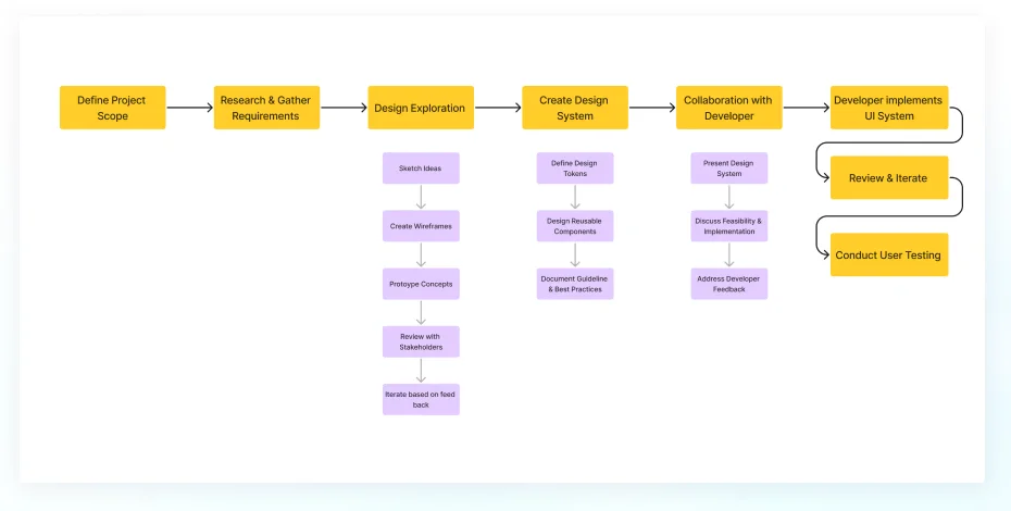
The developer collaboration step was the important one. Presenting the system to developers before it was finished, and discussing feasibility early, caught problems while they were still cheap.
Prototyping in Four Steps
Each stage answered a different question, and each one fed the next with stakeholder feedback.
| Stage | Question it answered |
|---|---|
| Paper prototypes | Does the layout and interaction flow make sense at all? |
| Low-fidelity in Figma | Do the basic components work together? |
| High-fidelity | Do the colours, type, and imagery hold up? |
| Clickable prototypes | Can stakeholders and test users move through it like the real thing? |
The Final Kit
The finished kit pairs a full Tailwind colour palette, every hue in every step, with components designed on top of it: dialogs, alerts, accordions, a date picker, and progress indicators, plus sample pages that show them composed together.
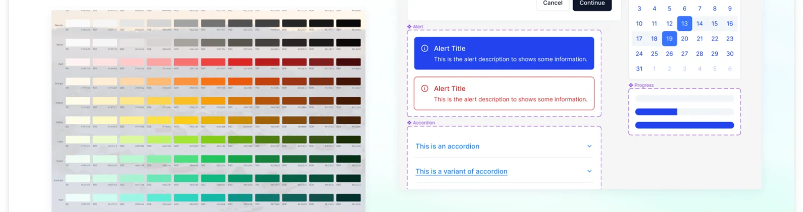
Because the palette is Tailwind's own, a colour in the design file has the same name in the code. A developer reading the mockup never has to ask which blue.
Results
| Result | Where it came from |
|---|---|
| Faster design iteration | The step-by-step prototyping approach |
| Happier stakeholders | Feedback built in at every prototype stage |
| Better engagement in user testing | Clickable prototypes tested with real users |
| 10% less development time | High-fidelity prototypes developers could build from directly |
The next step is growing the toolkit so website design gets more accessible for people who aren't designers. The full visual case study is on Behance.