Overview
Billjot is a point-of-sale system for small restaurants: the kind of busy, locally famous family place that still bills on an old machine and keeps tabs in a notebook. The goals were short: build a POS that fits in your hand, make it easy for anyone on staff, and let each restaurant shape it to how it works.
I did it alone, as a freelance project in the final year of my B.Tech: the research, the design, the development, and the testing in real restaurants. It started life as Own Your Bill; today it's Billjot, billing and point of sale for restaurants and shops across India.
Phase 1: The Story
It started with an observation. A restaurant in the lunch rush: staff juggling orders, the kitchen shouting updates, and a cashier stuck with a frozen billing system. The owner muttered that he only wished it worked as smoothly as it should.
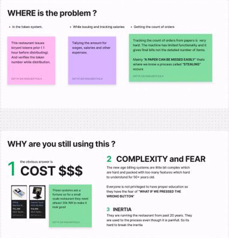
That scene wasn't unique, so I asked owners three questions: what are you using, where does it hurt, and why are you still using it?
| Question | What owners said |
|---|---|
| What do you use? | An old-school billing machine, plus a notebook for tabs |
| Where is the problem? | Issuing tokens, tallying wages and expenses, and counting orders: paper gets lost, and lost paper means stealing |
| Why not switch? | Cost: modern systems run ₹30,000 or more. Fear: complex systems scare staff who worry about pressing the wrong button. Inertia: twenty years of doing it one way |
Phase 2: The Sherlock Holmes Part
One restaurant isn't a market. I classified restaurant types the textbook way, about twenty of them from dhabas to tiffin centres, then grouped them by how they actually take orders and bill.
| Major type | Includes | How they bill |
|---|---|---|
| Traditional and regional | Dhabas, ethnic restaurants, sweet shops, halwai shops | Regional food, often one bill at the end |
| Modern and casual dining | Fine dining, casual dining, multi-cuisine, buffets, pubs and bars | Table service, many rounds per table |
| Quick and on-the-go | Quick-service restaurants, food trucks, street food, tiffin services | Fast, high volume, often takeaway |
| Speciality and cafés | Cafés, bakeries, seafood places, canteens | Counter orders, packaged goods |
Then came the hard questions, asked the same way of each group: system reliability, ease of use, inventory, payments, role-based access, and custom features. Quick surveys covered 168 restaurants across Vijayawada, Kakinada, Rajahmundry, Tuni, and Yanam, and in-depth interviews covered two dozen restaurants over 18 days.
Constraints and the Market
The big players were already there: Petpooja, RanceLab, Posiflex, Vyapar, and Gofrugal. The target was everyone they priced out: basic, locally famous family restaurants up to 3-star hotels.
I wrote down my own limits as plainly as the market's, because they shaped every decision after.
| Constraint | What it meant |
|---|---|
| Money | No budget for travel, more research, or prototype hardware |
| People | The first version was solo: research, design, build, and test |
| Time | Final year of a B.Tech, so academics came first and travel was limited |
| Market | Going against established products, so the audience had to be hooked from day one |
The First Design, and What Testing Changed
The first design was a desktop screen sketched on paper: table numbers down the side, items in a grid, the bill and a print button on the right.
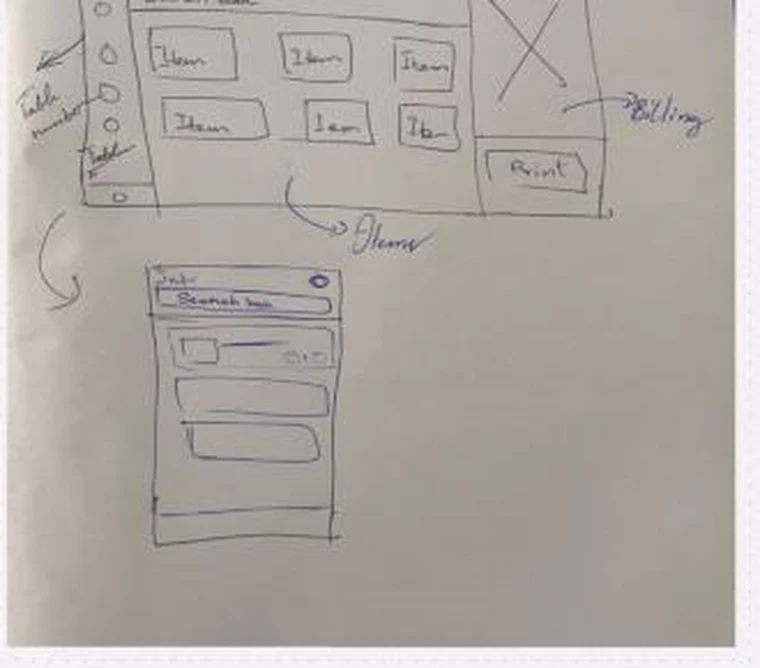
I released it and tested it in restaurants. The feedback was clear about where it worked and where it didn't.
| Feedback | What I did |
|---|---|
| Good for traditional restaurants that bill at the end | Kept that flow exactly as it was |
| Desktop version is good | Left it alone |
| Bad on mobile | Made the phone view the focus of the next round |
| They wanted something like Swiggy | Designed the phone flow around browsing and tapping items |
Key Decision: Design for the Waiter's Phone
Restaurants with table service don't bill at a counter; they take orders on the floor. So the phone flow became the main design: the waiter picks a table, adds items, and sends a temporary bill that becomes the kitchen order ticket. The counter sees every table's bill live, and prints when the table leaves.

The desktop layout was then rebuilt as an annotated wireframe for a takeaway restaurant with one user: logo and navigation on the left, categories and search on top, order cards in the middle, and a billing panel on the right. Current orders sit as cards along the bottom that you swipe through.
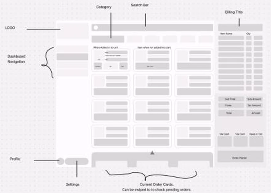
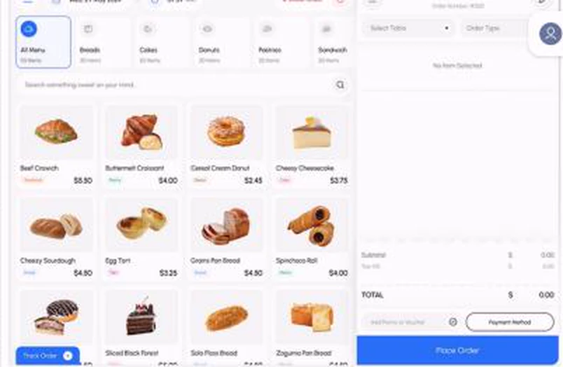
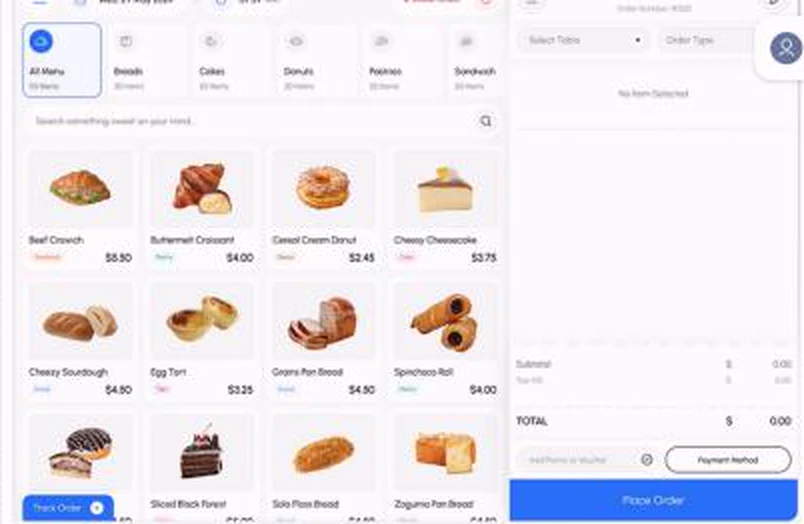
A bakery owner then asked for a version of their own, and that became Version 2: categories as tabs, product photos, and the order panel always visible. The process followed a triple-diamond, user-centred approach: research, then experiment, then deliver, with a review loop at the end.
Phase 4: Deployment
By 29 December 2024 the system was running in 8 restaurants, the ones that had supported me from the start. Each deployment was software and hardware, at a making cost of ₹6,200 per unit, built on Next.js as a PWA, Node.js, and MongoDB, served from a Raspberry Pi in the restaurant.
I tracked which features each restaurant actually used. That turned out to be the most useful design input of the whole project.

The core (offline mode, printing, inventory, analytics, sync, and access control) was used everywhere. The extras split the room: barcode scanning only mattered to places selling packaged goods, and tabs only to places with regulars. Nobody used the payment gateway, because every restaurant already had its own UPI; the virtual wallet and custom website went unused too.
What I Learned
| Lesson | Where it came from |
|---|---|
| Fear is a design problem, not a training problem | Staff afraid of pressing the wrong button kept old machines running for twenty years |
| Test early, even on paper | The first release showed the phone view mattered more than the desktop |
| Customisation means turning things off | Most extras were used by three restaurants or fewer |
| Don't rebuild what people already have | Every restaurant had UPI, so the payment gateway went unused |
The full research board, with the interview tables and sketches, is on FigJam.