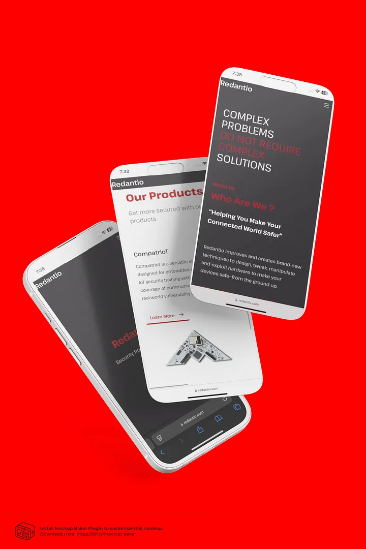
Introduction
How I built a brand, interface, and experience with no sleep, no team, and all heart.
🚀 The Challenge
6 hours.
One designer.
Zero room for error
Target Audience : A specific set of Bureaucrats
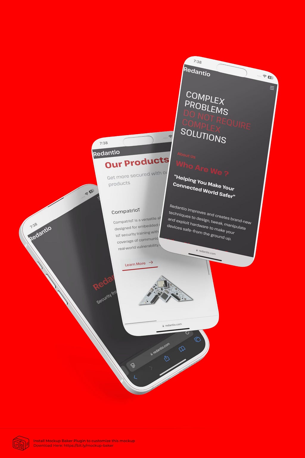
To me REDANTIO was a test: a real-world simulation of what it’s like to be in the trenches of a startup. Limited resources. An impossible deadline. And a vision that needed translating into pixels. Fast.
I knew I had to move quick, think smarter, and wear every hat in the design department. I was designing the interface, and with it the first impression of an entire cybersecurity brand.
🛠️ The Plan (Trust the process) :
You can’t build a building without pillars, right? Even in chaos, structure matters. Here’s the game plan I followed:
1. Wireframing
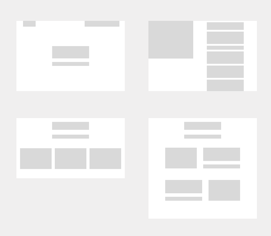
I started with bare-bones wireframes: think black, white, and boxes. No time to overthink, just enough to lock down the layout and flow.
2. Color Check
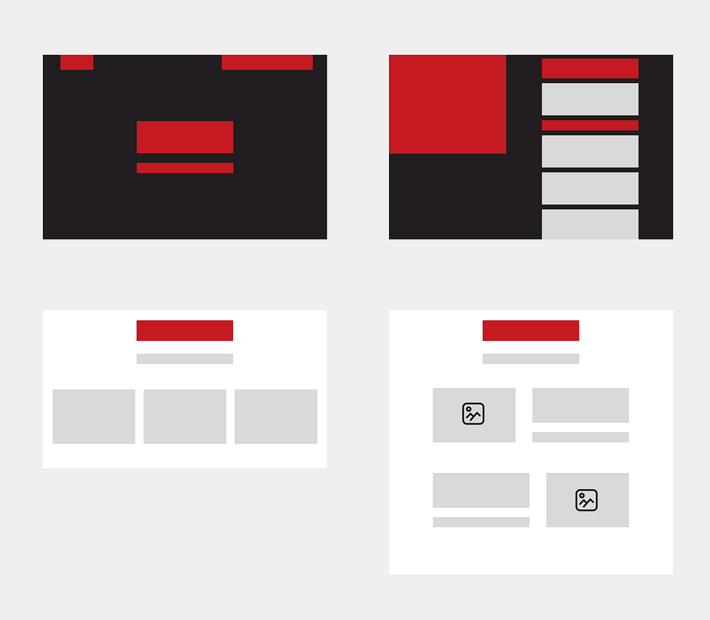
Next came the heartbeat of the brand: color. I tested contrast, accessibility, and emotional tone. It had to feel like REDANTIO: bold and energetic.
3. Micro Animations
Animations are like seasoning: too much and it’s overpowering, but just the right amount? Chef’s kiss.
In REDANTIO, I wanted every scroll, hover, and click to feel just a little more alive, without shouting for attention. That’s where micro animations came in. These tiny interactions became the soul of the UI. Subtle, smooth, and meaningful.
- Scroll Reveals:
Using AOS.js (Animate On Scroll), I made sections gracefully fade or slide into view as users scrolled. It gives the page a rhythm and gently guides where you look.
- Button Feedback:
Buttons gently scale or shift on hover. This gives users a moment of feedback: “Yes, this is clickable. You’re doing it right.”
- Card Animations:
Hovering over cards lifts them slightly with a soft shadow, creating a sense of depth and motion without breaking focus.
- Form Elements:
Input fields subtly highlight when selected. It’s about making users feel in control, confident, and cared for, even when they’re just typing an email address.
3. Final Design
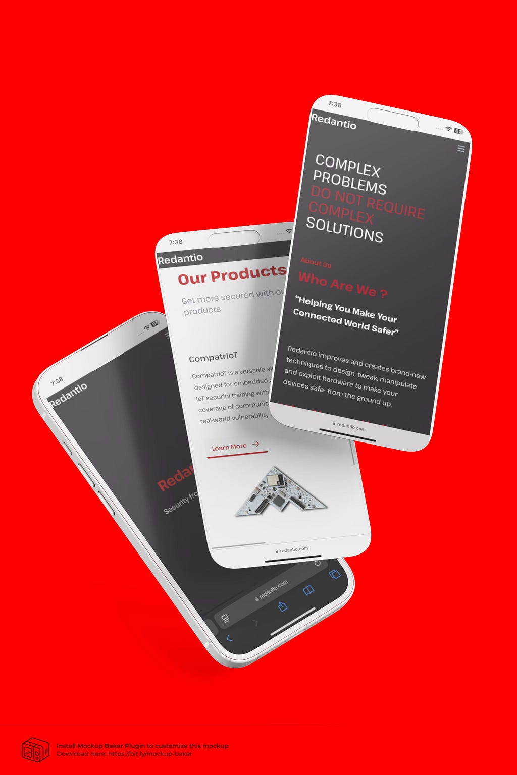
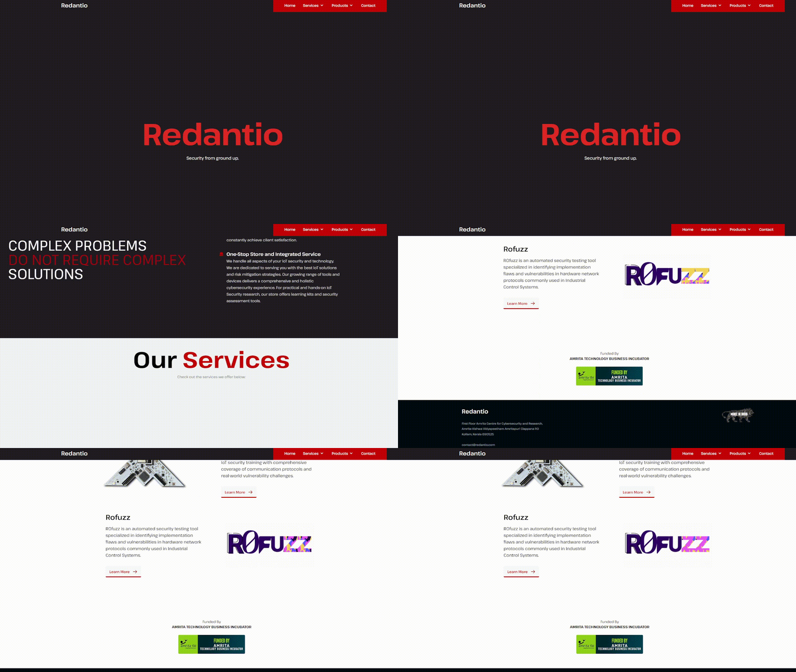
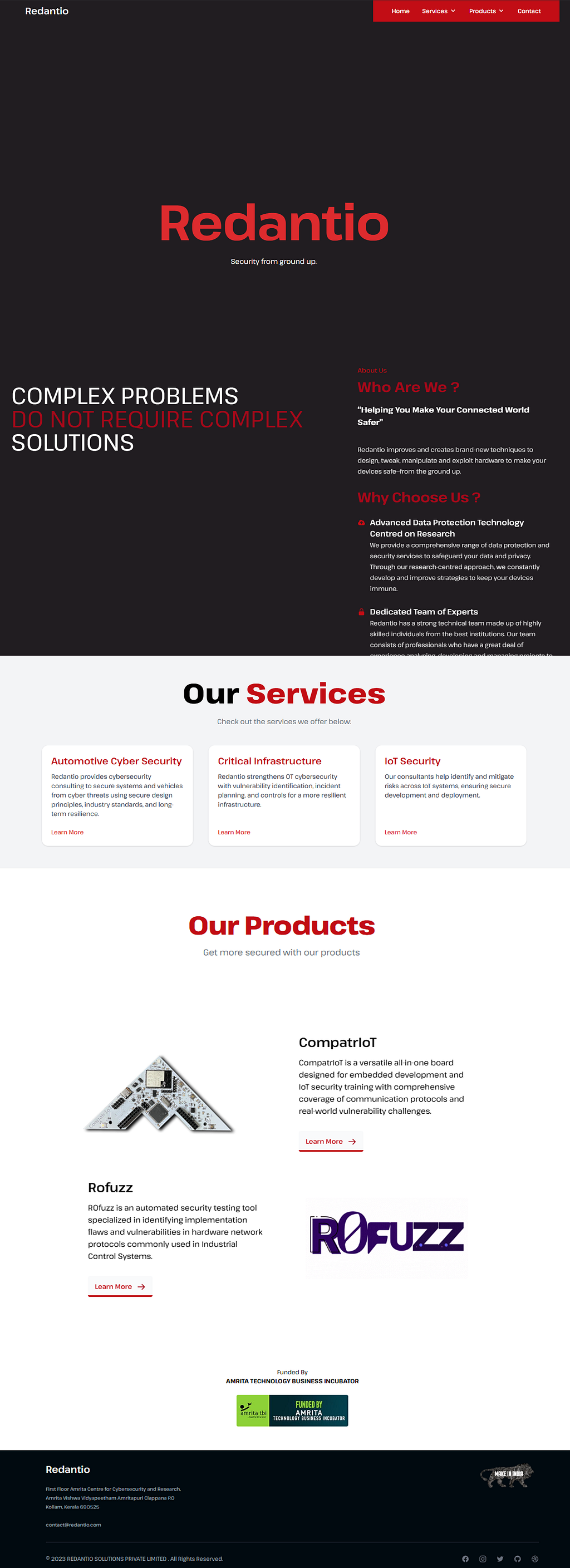
With structure and style in place, I hit full throttle on the visuals. Components, icons, typography: all crafted to strike a balance between aesthetic and functionality.
🎨 Design Language
I had one shot to get the look and feel right. It needed to be striking yet simple, designed for a target audience that values clarity and confidence.
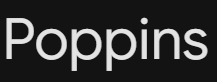
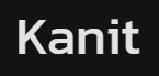
✏️ Typography

🎯 Color Palette
- 🔴 REDs (#C10206, #A50113): Vibrant, urgent, and memorable.
- ⚫ Grays: Soft background shades to let content shine.
🧱 Layout & Structure
Built with Tailwind CSS, every element had a purpose, with nothing extra.
- Responsive Grid: Scales smoothly from mobile to desktop.
- Whitespace: Intentionally placed to let the content breathe.
- Rounded Corners: Soft, modern edges to balance the bold palette.
🔁 Interaction & Feedback
How it feels to use matters as much as how it looks.
- ✨ Hover Effects: Tiny details, big impact. Every interaction gives you a little visual nod.
- 🌀 Scroll Animations (AOS.js): Smooth fade-ins and slide-ups that keep users engaged.
- 🔄 Transitions: Subtle but satisfying. Every click flows like water.
⚙️ Tools I Used
- Figma: Quick wireframes to full UI.
- Tailwind CSS: Fast, responsive layout creation.
- AOS.js: Animate on Scroll for delight.
- Raw HTML/CSS/JS: Speed > polish in this sprint.
🧠 Reflections
Designing REDANTIO was about possibility, and perfection could wait. It reminded me how much good design comes out of constraints. The time pressure pushed me in directions I wouldn’t have tried otherwise.
I pushed myself past the limit.
I designed for a real audience.
And I learned that even when you’re a one-person army, you can still build a kingdom.
Originally published on Medium.