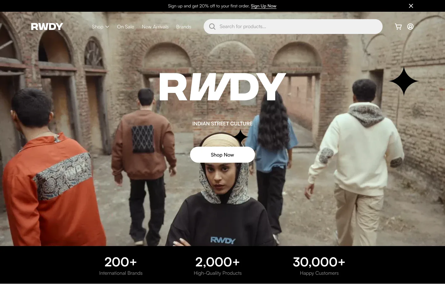
Overview
RWDY is a fashion label rooted in Indian street culture. Fashion retail lives or dies on presentation: people buy the feeling before they buy the shirt. This revamp of the store's homepage puts the brand's photography up front, keeps the products impossible to miss, and gives every section a single job.
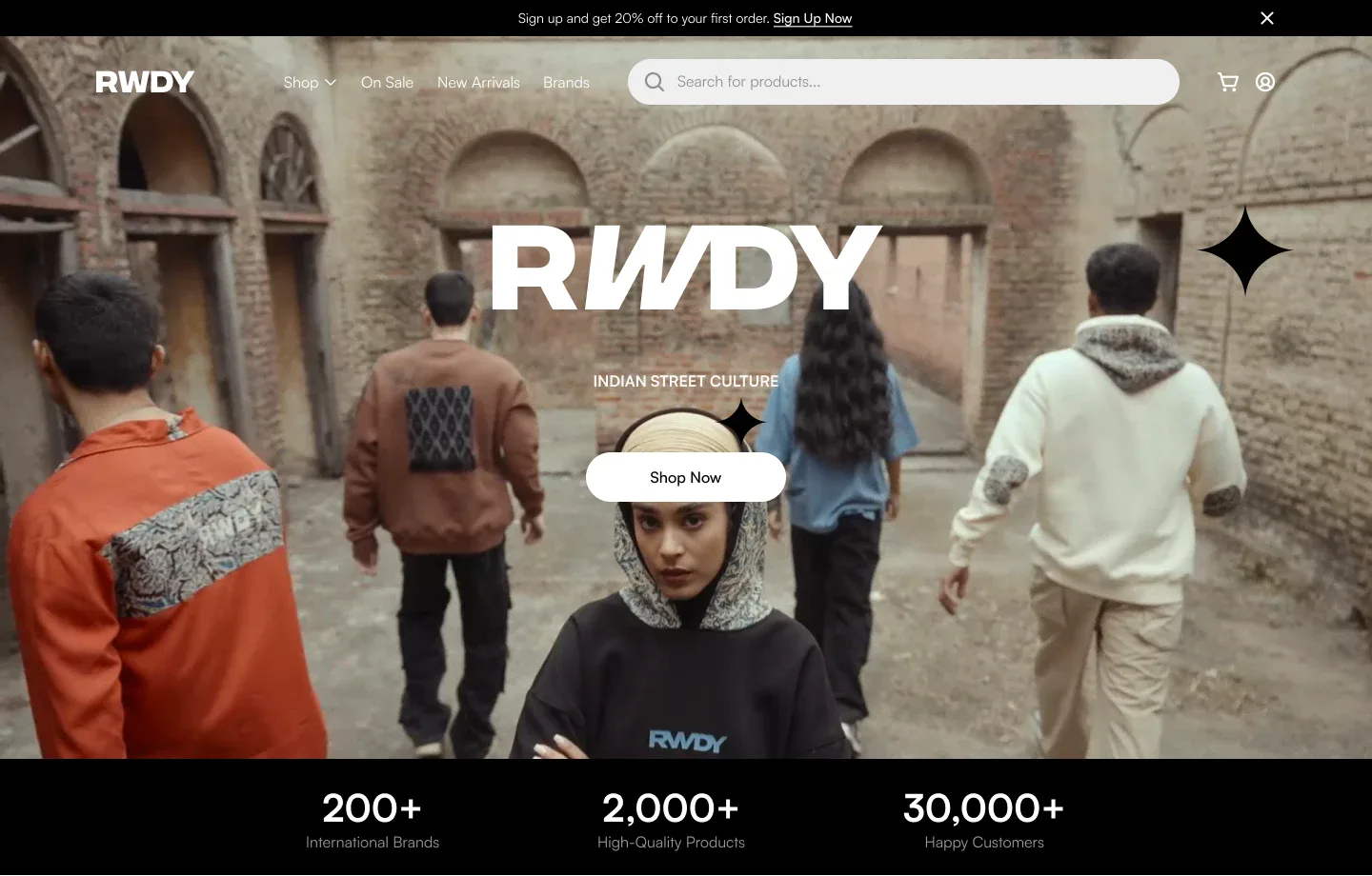
The hero does three things and nothing else: shows the people wearing the clothes, states the brand in one line (Indian street culture), and offers one button. The search bar and cart stay in the top bar, because returning shoppers come to find something specific.
One Page, Six Jobs
A long homepage works when each band answers the next question a shopper has. I planned the page as a sequence, top to bottom.
| Section | The shopper's question | The answer |
|---|---|---|
| Hero | Is this brand for me? | Campaign photography and one line of identity |
| Proof bar | Can I trust it? | Brand, product, and customer counts in large type |
| New arrivals | What's new? | Four products with rating, price, and discount |
| Top selling | What do other people buy? | The same card, sorted by popularity |
| Swag, Style, Street | What's the attitude? | A full-width campaign band |
| Reviews and call to action | Will I like it? | Customer quotes, then one last push |
Key Decision: Products Before Decoration
The product card is the most repeated element on the page, so it got the strictest rules: the product on a quiet background, then the name, the rating, and the price, always in that order. Discounts show as the old price struck through plus a small percentage tag, so a deal is visible without shouting.
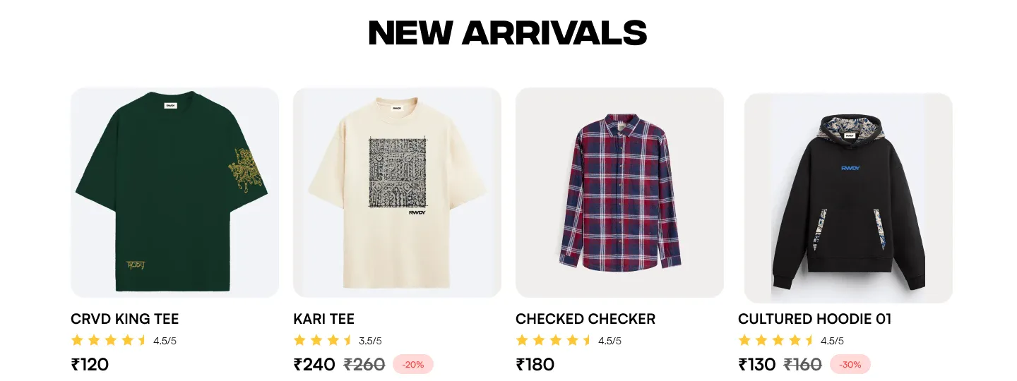
Four cards per row and a single View All button keep the grid scannable. The same card is reused for Top Selling, so shoppers learn it once.
Key Decision: A Brand Band, Not a Banner
Between the product grids, the page stops selling and starts showing. Three campaign photographs run edge to edge, each with one word over it: Swag, Style, Street. It is the only place on the page where the type gets loud, so it reads as a statement instead of another ad.
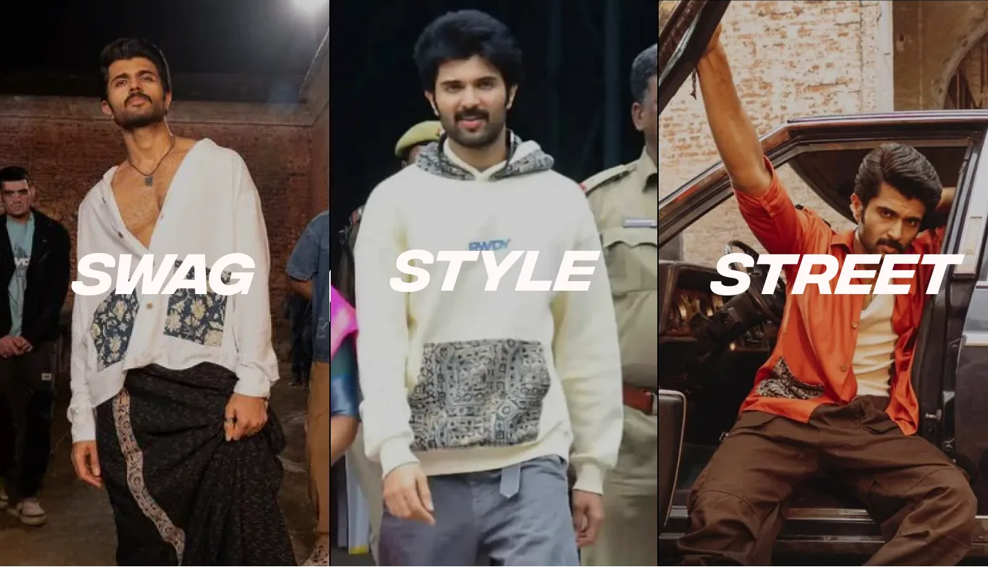
Placing it after the products, not before, was deliberate. Someone who came to shop has already seen what's on offer; this band is for the person still deciding whether the brand is theirs.
Closing the Loop
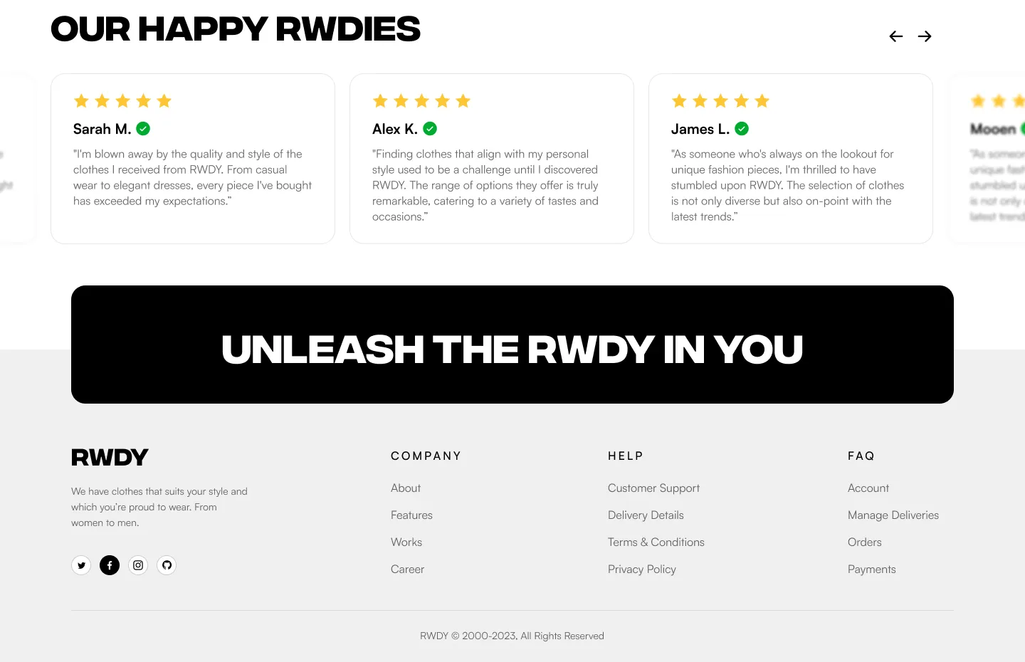
The bottom of the page answers the last doubt. Customer reviews run as a carousel, each with a verified mark and star rating, then a black call-to-action bar repeats the brand line. The footer stays plain: company, help, and FAQ links where people expect them.
The Visual System
| Element | Choice | Why |
|---|---|---|
| Display type | Heavy, extended capitals | Matches the confidence of street fashion |
| Body type | A clean sans-serif | Product names and prices stay easy to read |
| Colour | Black, white, and warm off-white | Lets the clothes and photography carry the colour |
| Badges | Stars, verified ticks, discount tags | Small trust signals beside the facts they support |
| Photography | Full-bleed, people in motion | Sells the feeling, not just the garment |
The design is published on Behance.